All posts by David Sales
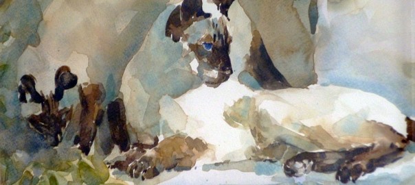
Paint Like Sir William Russell Flint With Infinite Painter App
[This post supplements three videos on watercolour emulation with the Infinite Painter app. If you prefer watching to reading, you can find the videos here.]
Digital Painting: The Positives
If you’ve tried your hand at painting with traditional media such as oil or watercolour, you’ve probably been irritated and frustrated at times by the sheer messiness and imprecision of it all. You find yourself surrounded by smelly rags (oil), soggy tissues (watercolour) or clouds of pigment dust (pastel) as you try to fathom the vagaries of colour-mixing, tone control and technique (especially watercolour technique). Wouldn’t it be nice to work in a medium that lets you focus on the essentials of painting and minimises the distractions of equipment and technique – a medium that’s completely clutter-free and that lets you control all your materials with mathematical precision? If that sounds appealing, then you might enjoy exploring the world of digital painting, Continue reading Paint Like Sir William Russell Flint With Infinite Painter App
Watercolour and transparency
the watercolour conscience
For whatever reason, watercolour seems to attract more than its fair share of purist ideas and rules. We are told: ‘always use a fully-loaded brush’; ‘don’t use black’; ‘don’t use white’; ‘don’t use resists’; ‘don’t use opaque colour’; ‘don’t use more than one/two washes’; ‘use only the most transparent pigments’; and so on. While there may be merit in a lot of this advice, when it’s presented as ‘never’ or ‘always’ statements, it can become something of a straitjacket for the beginner if he takes it too literally. It leads to a sort of watercolour conscience where we experience feelings of guilt if we fail to live up to the purist dogma – feelings which even someone of the stature of Rowland Hilder admitted to experiencing. It was only after studying the watercolours of Turner that Hilder felt comfortable with his ‘impure’ technique and realised that using body colour and Indian ink was not a violation of the medium. The idea that there is a right and a wrong way to paint in watercolour tends to be reinforced by the instructional style of some of its teachers: people like Edgar Whitney and Edward Wesson, both of whom were forceful communicators with strong opinions on how watercolour should be handled. Their facility with the medium could be both inspiring and daunting at the same time to the beginner.
To illustrate the problem, I’d like to look at one quality of watercolour – perhaps its defining quality – which has purist associations: transparency. Continue reading Watercolour and transparency
Elements and principles of design: 2
In the previous post I dealt with the elements of design, trying to define them and to show how they relate to each other. This post is an attempt to do the same with the principles of design.
Perhaps we should begin by asking what is meant exactly by principles of design? What do they do?
Elements and principles of design: 1
The elements and principles of design are a kind of compositional toolkit; they make it possible to analyse and construct pictorial arrangements in a systematic way. The elements are the physical manifestations of the painter’s art, the raw materials – things like colour and value and line; the principles are the tools and techniques which are used to manipulate and organize the elements.
Unfortunately, although there is a scholarly feel to many of the accounts of the elements and principles (and in fact many of the references I’ve used are academic in origin), there are variations in the terminology and definitions from one source to another which tend to add confusion to an already complicated subject.
Composing a painting
If there is one aspect of picture-making that distinguishes the trained, professional painter from the able amateur, it is composition. Despite the wealth of information available on the subject in books and online, it’s not so easy to find a description of a coherent, practical method of composing a painting.
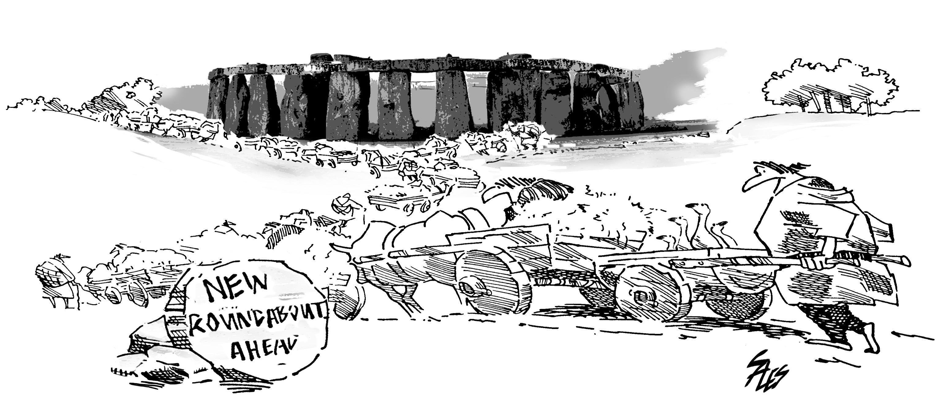
Art with a purpose: the cartoon
Modern and contemporary painting all too often seems like a solution in search of a problem. The contemporary painter is obliged to qualify and explain his work in terms of some unique, personal vision or concept; art exhibitions today involve as much reading as looking. But it wasn’t always this way: in the past, artists were patronised and commissioned to produce great art; art was a business and the client supplied the artist not only with remuneration but also with purpose. By today’s standards, the range of subject matter was narrow and predictable; religious, historical and mythological themes dominated. But the artist had the benefit of a brief – and probably in many cases a detailed one. The question of what to paint – or even why to paint at all – wasn’t a source of concern for the artist; all he had to do was to decide how to paint. Unlike the contemporary artist’s open-ended, high-minded (and sometimes desperate) search for originality and authenticity in his work, the Renaissance painter’s challenge was confined to one of design: finding a way to satisfy the patron’s requirements and his own artistic preferences at the same time.
You could argue that the artist of the Renaissance had more in common with the contemporary illustrator than the contemporary fine artist not only in working to a brief but also in observing traditional techniques and craftsmanship. Having a purpose, being able to establish clear objectives, makes a difference.
One under-appreciated form of art-with-a-purpose is the cartoon.
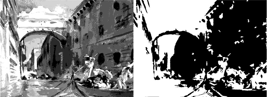
Composition: contrasts of line
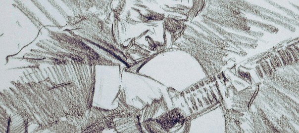
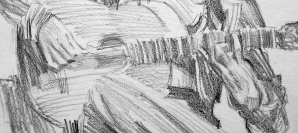
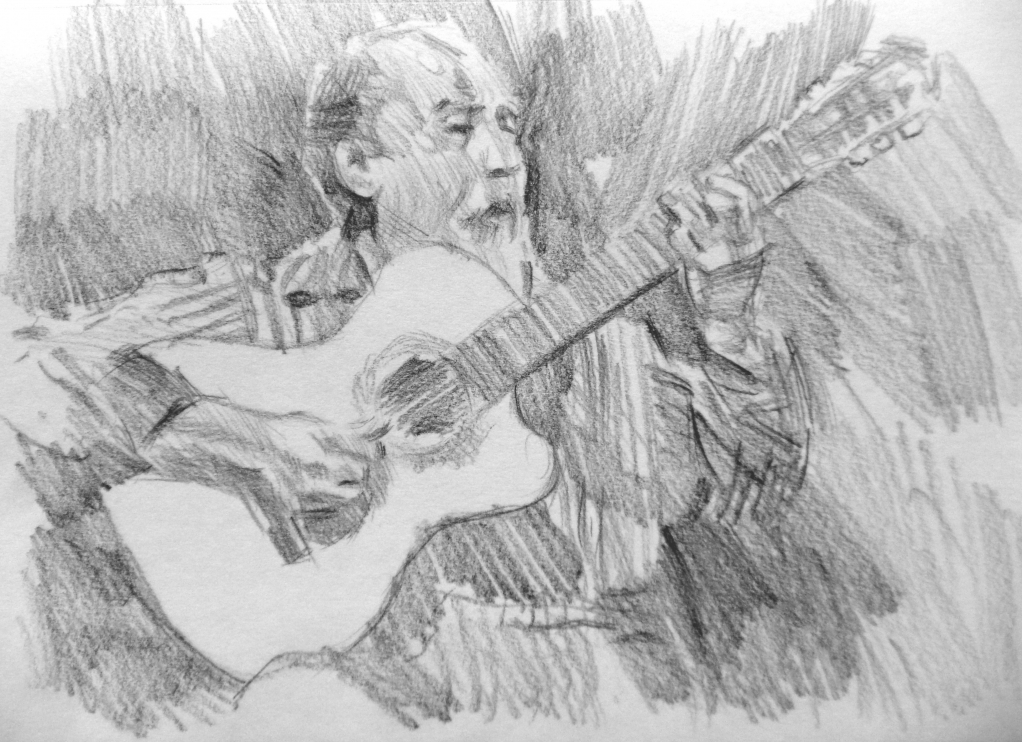
the Guitarist series
The Guitarist series of drawings started out as a distraction: an attempt to produce something resembling art on a regular basis as an antidote to work. The choice of guitarists as subject matter proved to be a challenge both in terms of drawing and composition. During the course of filling three sketchbooks with pencil studies, I began to understand a little about the compositional possibilities of line: how it can be used to move the viewer around the drawing and how to create focal areas by means of linear contrasts.
Guitarist drawings project
Over the past two years or so, I’ve managed to fill two or three sketchbooks with studies of guitarists – usually flamenco guitarists. All of the drawings were made from YouTube videos or Web images and the average time spent on each was around three-quarters of an hour. Initially, they were done simply as drawing exercises with the main aim being to record the image as accurately and economically as possible.
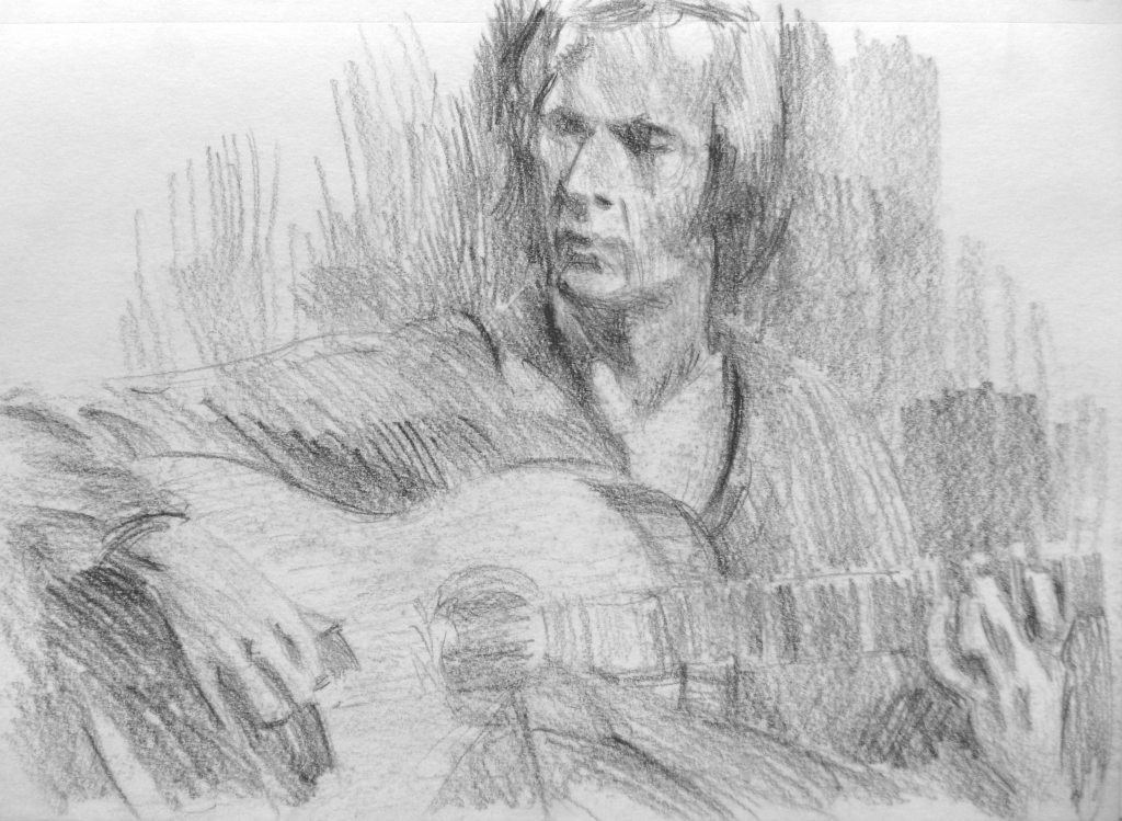 Eventually, I began to experiment with drawing technique to try to suggest the energy and brittleness of flamenco music. The hands of the classical or flamenco guitarist are a fascinating study in themselves – especially the left hand with its strength and flexibility, the square-shaped fingertips and the compositions which the hand creates holding down a chord or fingering a scale passage. The instrument too is a challenge to draw: getting the perspective and proportions correct is difficult enough but trying to find ways to depict the fingerboard or the intricacies of the machine heads without drawing every fret, string and gear is more difficult still.
The benefits of attempting a lengthy series of studies on a narrow theme are well worth the time and effort involved. They range from the trivia of technique (which makes/grades of pencil and paper gave best results) to the compositional possibilities of a subject which at first sight does not seems to offer too many options.
 I’ve used a number of these drawings as studies for paintings and in a future post I will show how Photoshop can be used to bridge the gap between a pencil study and a watercolour painting.
The Drawings gallery contains a selection of these sketches.
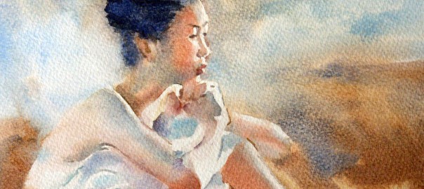
The watercolour technique of Liu Yi
It’s not often that I add a new artist to my list of favourites – especially a watercolour artist. But on seeing the work of Chinese artist Liu Yi a few years ago, I felt he had to be included somewhere near the top of that list. His paintings display an exceptional control of the watercolour medium without sacrificing any of its freshness and spontaneity.
Liu Yi was born in Shanghai in 1958. I first came across his watercolour paintings in an article entitled ‘Destiny With Water’ in International Artist magazine (Issue 50, Aug-Sep 2006). The text of that article, in which he describes his watercolour technique, is available on this site. The paintings, a series of watercolours of ballerinas, can be seen on Liu Yi’s own website.