The elements and principles of design are a kind of compositional toolkit; they make it possible to analyse and construct pictorial arrangements in a systematic way. The elements are the physical manifestations of the painter’s art, the raw materials – things like colour and value and line; the principles are the tools and techniques which are used to manipulate and organize the elements.
Unfortunately, although there is a scholarly feel to many of the accounts of the elements and principles (and in fact many of the references I’ve used are academic in origin), there are variations in the terminology and definitions from one source to another which tend to add confusion to an already complicated subject.
The versions offered by Edgar A. Whitney, Nancy Doyle and Charlotte Jirousek illustrate this variability. The source of Whitney’s version is his book, ‘Complete Guide To Watercolour Painting’.
Whitney identifies seven design elements: line, value, colour, shape, size, texture and direction. Doyle’s list also consists of seven elements: mark, line, colour, value, shape, texture and space; she doesn’t include size or direction and she adds mark and space to Whitney’s list. Jirousek’s list includes point, line, form+shape+space, movement, colour+value, pattern and texture. She regards value along with hue as a component of colour; point is synonymous with Doyle’s mark. She treats form and space or shape and space as complementary, mutually defining elements. The addition of movement is unusual; it’s normally regarded as a design principle rather than an element.
Whitney’s inclusion of direction in his list is typical of the confusion that surrounds the definition and description of these elements and principles. By direction he means direction of line – which might be regarded as a property of the line element rather than as an element in its own right. In a similar way, line, colour, shape and texture always have a property of value. However, value is almost always identified as a separate element.
It’s a similar story with the design principles. Whitney lists eight: balance, conflict, harmony, dominance, gradation, alternation, repetition and unity. Doyle also has eight: balance, contrast, harmony, emphasis, movement, proportion, variety and unity. Jirousek, however, identifies only five: balance, emphasis, rhythm, proportion and unity.
This inconsistency in terminology extends to the definitions and descriptions of the elements and principles. In Whitney’s description of his principles, he equates conflict to contrast and gradation to movement. Jirousek includes gradation, alternation and repetition as examples of rhythm. With the possible exception of contrast (which is implied in emphasis and/or variety), Doyle’s list is probably more typical than the other two.
In fact, almost every description I’ve studied is unique in some respect. Part of the problem is that the elements and principles are applicable to disciplines other than painting: from web design to textile design, from music to sculpture. In general, the academic and web design sources are more consistent and clearer in their accounts than the painting ones.
So, where to begin?
The first task is to try to define each of these design elements and principles. This will involve clarifying the relationships between elements and between principles, and identifying any hierarchical organization within each group.
Definitions: the elements
Point
A point has no mass, no visibility; it’s a purely geometric concept. The only property of a point is its position, defined by its x,y coordinates. A point is a conceptual design element.
Line
Line may be a conceptual or a visual element. As a conceptual element, it is thought of as an infinite series of points or as the path of a moving point. A conceptual line has length and direction but no thickness. As a visual element, it is a type of mark and has thickness as well as length and direction.
Mark
A mark is any kind of visual element although it is often used more specifically as the graphical equivalent of the conceptual element of a point (as in Doyle’s list above). Line and shape are also marks.
Shape
Shape, mark (in the narrow sense) and line are the primary visual elements. A shape, to be perceived as a discrete element, must have a definite boundary which may be defined by line, colour and value, either individually or in combination. So where line peters out, colour takes over; where colour is desaturated, value provides contrast with adjacent shapes.
The conceptual equivalent of a shape is the plane. A plane is considered to be the path of a moving line.
In practical terms, it’s not so easy to pinpoint the differences between a mark, a line and a shape. You could say a mark is a dot, a single dab of pigment, the brush touching the canvas and immediately retreating. A line, on the other hand, is a stroke, a single movement of the brush across the canvas. A shape would be defined as a succession of strokes, blended together. However, you could create a line by a single dab of, say, a 2” flat brush or use the same brush to paint a 2” square with a single stroke.
Space
In the beginning, there was space…the blank canvas.
There are two definitions of space, as it relates to two-dimensional works. In the first, space is the gaps between marks; the ‘accidental’ or negative shapes that are the unobscured remnants of the ground or blank canvas. In the second, space is equated to the illusion of depth in a painting which is created, for example, by the devices of linear and aerial perspective.
Whitney and other sources don’t include space as an element of design at all. So is it essential? Or can it be ignored?
Because space is a negative concept – it’s a consequence of the positive marks which the painter makes – it’s not an element that can be manipulated directly. In practice, space is indistinguishable from shape – and the term negative shape is often used instead. So space, at least in terms of the first definition, could be disregarded.
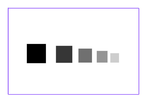
What about space as the illusion of depth? This is a very different notion to the first definition. Space in this sense is not really an element: it’s an emergent property of a particular configuration of marks. For example, a line of shapes, decreasing in size and graded in value appear to recede in space. The arrangement itself is responsible for the illusion.
Space as depth has been a preoccupation of artists past and present, whether in creating illusionistic deep space through linear perspective or deliberately avoiding it in abstract and non-representational works.
Value
Value or tone is the brightness – the lightness or darkness – of a mark. Value always exists as a property of a mark; you can’t have a shape, say, that has no value. Value is a non-optional property.
Colour
Colour may also be regarded as a property of a mark. Colour is actually two properties: hue and saturation (also called chroma or intensity). Because colour also embodies value, it is possible to consider colour and value as a single property in which ‘pure’ value equates to desaturated colour.
Colour, unlike value, is an optional property.
Texture/Pattern
Texture and pattern are both produced in essentially the same way – through the repetition of marks. Stipple, for example, is the repetition of a point-like mark such as a dot; hatching is the repetition of line. Pattern also involves rhythm, the regular spacing of marks.
Direction
Direction is a property of line and shape (at least those shapes which have long and short axes). It is a relational property, the reference being the edges of the canvas.
Direction is an effective way to communicate mood and movement. Allowing horizontal lines to dominate a composition, creates a feeling of tranquility and repose. Vertical lines may suggest grandeur, even spirituality. A combination of the two gives stability to an arrangement.
Oblique lines convey energy and activity and, especially when they conform to perspective, they suggest or induce movement, creating a path for the eye to follow around and into the work. A balanced composition involving oblique lines is a form of dynamic equilibrium, a state of tension.
Size
Size is another property of a mark. Increasing the size of an element increases its visual weight.
Position
Position, like direction, is a relational property. Changing the position of an element within the frame changes its visual weight. An element high in the frame will be perceived as having more weight than one lower down – in physics terminology, it will have more potential energy.
Weight
Weight or gravity is classified by one source as a relational visual element. Various properties such as size, value and position contribute to the apparent visual weight of a mark (see the notes on balance below). In this sense, weight is an emergent property of a particular configuration of other properties of a mark.
Putting it all together…
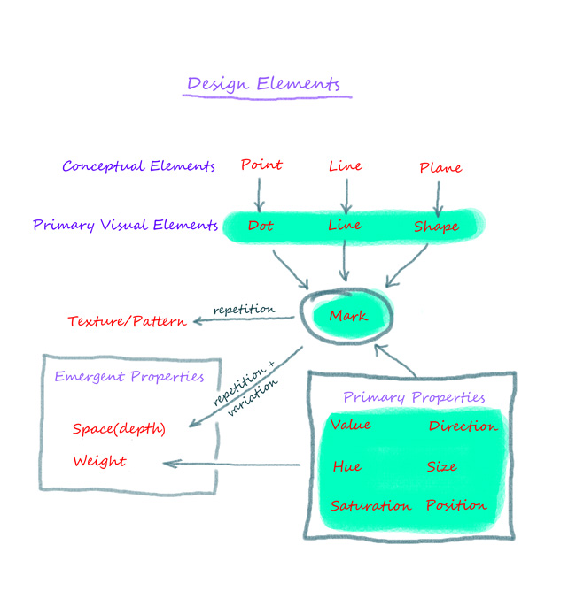
As well as defining the elements, I’ve also tried to show how they relate to each other and this has led to the reclassification of some elements as properties. This chart is my interpretation of the relationships between the elements and properties described above.
At the head of the hierarchy is the mark which encompasses dot, line and shape; these are the primary visual elements. A mark is characterized by six primary properties: value, hue, saturation, size, position and direction. Texture and pattern are created through the repetition of a mark or marks. The visual weight of a mark is determined by the six primary properties and, along with space, is classified as an emergent property. The elements and properties highlighted in blue are those that can be directly manipulated in the process of composition.
The next post will deal with the principles of design.


реабилитационный центр для наркозависимых реабилитационный центр для наркозависимых .