the Guitarist series
The Guitarist series of drawings started out as a distraction: an attempt to produce something resembling art on a regular basis as an antidote to work. The choice of guitarists as subject matter proved to be a challenge both in terms of drawing and composition. During the course of filling three sketchbooks with pencil studies, I began to understand a little about the compositional possibilities of line: how it can be used to move the viewer around the drawing and how to create focal areas by means of linear contrasts.
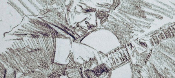
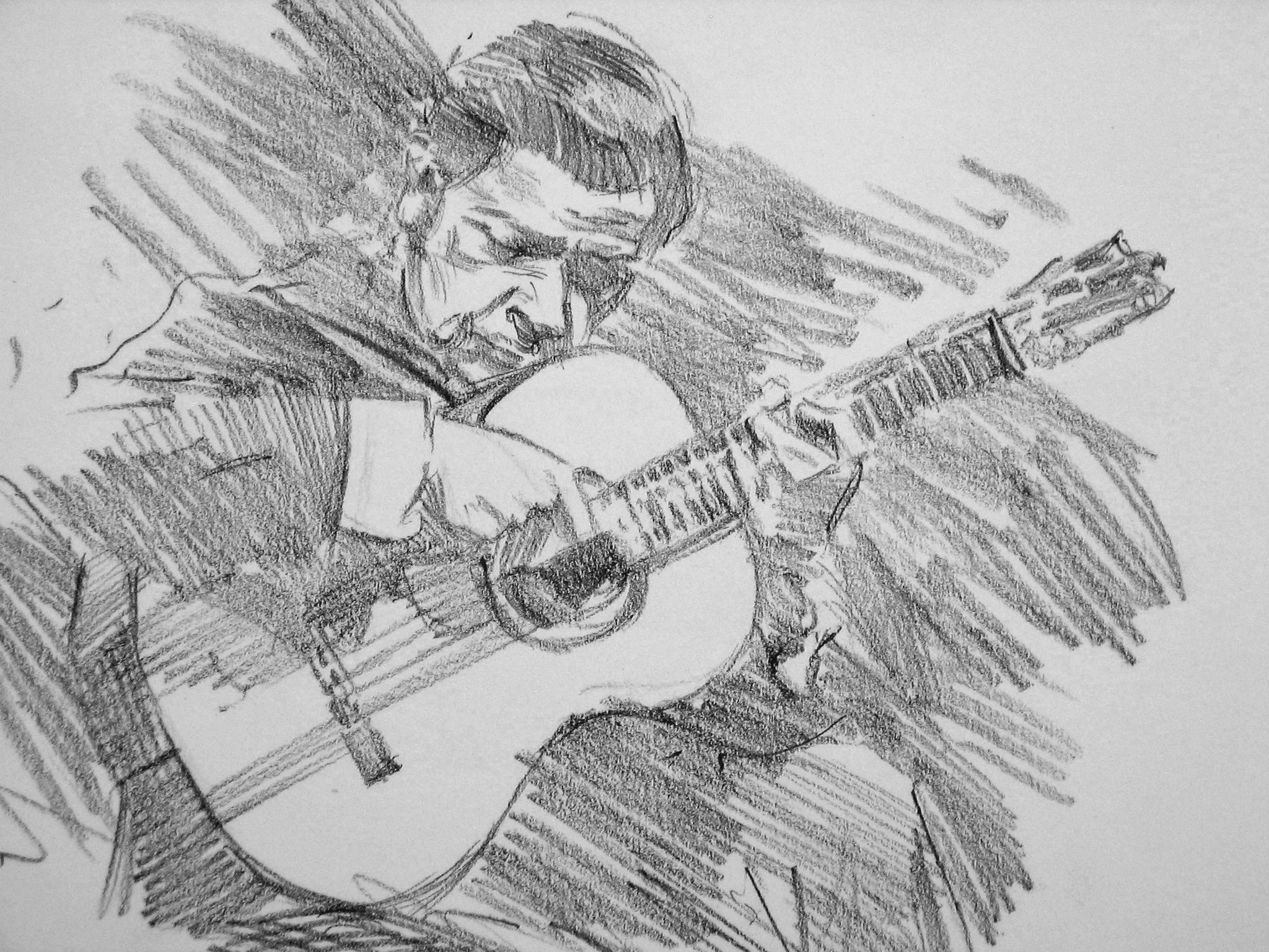
I’ll use this drawing to illustrate some linear contrast devices.
contrasts of line
There are a number of ways to create contrasts with line: probably the simplest is to vary the thickness or weight of line. A heavy line tends to come forward. Pen and ink artists use this device frequently – for example, to make a foreground tree stand out in a landscape against a backdrop of fields and hills. As well as contrasting a heavy (thick) line with a fine line, it’s also possible to vary the weight of a single line – making it thick and thin. Comic book artists favour this line when they depict their superhero characters. In this case, the variations in weight are used to model form: the heavier the line, the greater the implied curvature of the form – typically the bulk of a muscle. Is this a form of contrast? I think it is. In this example, it is contrasting smooth curved forms with angular ones.
An extension of the idea of varying the weight of a single line is the device known as a ‘lost-and-found’ edge. Here, the weight of the line is reduced to zero in places. But even though the line is incomplete, the explicit parts imply the missing sections. In other words, you can construct the whole line from the visible fragments. The effect of this device (in a figure drawing, for example) is to suggest variations in illumination: the line of the shoulder/upper arm in the drawing demonstrates this impression of changing light as does the broken line between the right hand and the shirt cuff. Using this implicit/explicit line is a way to integrate figure and ground, to allow elements of subject matter to merge tonally and as shapes. It also represents a type of visual trigger: a configuration of design elements that the eye (or brain) finds attractive or interesting. Perhaps it has something to do with the brain enjoying the game of finding the missing parts of a line.
Any line has direction. Lines having opposing directions will create a focus at the point of contact or intersection. In the drawing, the bulk of the shading in the figure and background is directional, running from top left to bottom right. This is opposed by the main lines of the guitar which run from bottom left to top right and also by the line of the guitarist’s right shoulder which runs parallel to the guitar. The contrast here isn’t felt at a single point but is expressed as a balance or tension over the whole composition.
The point is often made that diagonal lines in a composition suggest energy and movement whereas horizontal and vertical lines create an impression of repose and stability. In the drawing, diagonal lines dominate, but there are other devices which modify the balance between the opposing directions of the lines. First of all, the diagonal shading of the background is deliberately rough and indisciplined; the strokes are dense, heavy, and scribbled in places. They communicate urgency, energy – even aggression. The treatment of the guitar, by contrast, is measured and relatively delicate and open, with plenty of white paper in evidence. Here, line is creating a contrast of order/disorder. Secondly, the curved lines of the body of the guitar provide another contrast by countering the aggressive, straight-line background shading.
Despite the predominance of diagonal lines, there is one horizontal and one vertical line in the drawing which make an important contribution. The horizontal line is the upper boundary of the forearm; the vertical (or near vertical) is the outer edge of the leg. Together, they stabilise the figure and the composition, while creating a focal point by directing the eye to the left hand.
There is one more linear device which I’ve used occasionally in drawings and paintings of guitarists and that is to contrast freehand and mechanical lines. By mechanical I simply mean drawn with a ruler. These ruled lines were confined to defining the neck or fingerboard, the strings and, less commonly, the bridge of the guitar. I find that the inclusion of a few mechanical lines in a composition can contrast very effectively with freehand lines, especially if the subject matter is appropriate – architecture and guitars, for instance.
Line is probably the most expressive of all the design elements and provides endless compositional possibilities. It’s not surprising that many artists devote their entire careers to drawing rather than painting.
This post beautifully highlights the interplay between drawing and painting! I love the way you explain the contrasts in line work and texture. It’s fascinating to see how different mediums can convey such varied emotions and movements. I can’t wait to experiment with these insights in my own art!