If there is one aspect of picture-making that distinguishes the trained, professional painter from the able amateur, it is composition. Despite the wealth of information available on the subject in books and online, it’s not so easy to find a description of a coherent, practical method of composing a painting.
What exactly is composition? A working definition might be ‘a visually pleasing arrangement of the pictorial elements of a painting’. Examples of pictorial elements are line, value and colour. ’A visually pleasing arrangement’ would be the result of organizing the elements according to the set of established design principles which include balance, rhythm, proportion and unity. These principles and elements of design will be discussed later.
If your preference is for abstract, non-representational art, then composition is pretty much an exercise in pure design, as defined above. For the figurative or representational painter, however, there is an additional consideration: his subject matter.
Subject matter and pictorial elements are not the same thing. Pictorial elements are, if you like, the atomic structure of the painting, while subject matter is the large scale organization of these elements. We can go further: the elements can be arranged freely, without restriction. They are, in effect, abstractions. Subject matter, on the other hand, is a representation of reality and, at least in naturalistic works, must conform to our expectations of its behavior in the real world. The figure, for example, conforms to the constraints of its anatomy; it’s also constrained by the laws of perspective. The problem for the figurative artist is to compose his painting while observing these constraints. This is no easy task. It inevitably involves some degree of compromise between fidelity to the subject matter and the purity of the overall abstract design.
Naturalism introduces two other compositional complications: the first is the illusion of depth in a painting; the second is the suggestion of volume through the consistent modelling of forms.
Linear perspective is a powerful tool for creating the illusion of real 3D space while aerial perspective suggests the deep space of the landscape. Both have implications compositionally in that they restrict the choice of certain elements – value and colour in the case of aerial perspective, value and shape in linear perspective. In addition, because they introduce the illusion of depth, they affect movement in the work – that is, the path the eye takes through the composition. Depth cues exert a strong influence on movement and may create ‘holes’ in the design, leading the eye away from the intended focal point.
Modelling of form is the suggestion of volume by means of changes in value or tone; it’s really a special case of the illusion of depth. (Form is a confusing term: in sculpture, it refers to the three-dimensional structure of an object; here, in painting, it refers to the two-dimensional representation, i.e. the shape, of a three-dimensional object such as the human figure.) Consistent modelling of the forms in a painting will imply a light source or sources. This is a fundamental device in naturalistic, representational art. The illusion of volume, however, comes at a price in terms of compositional freedom: the colour, value and shape of shadows, for example, will all be constrained.
Let’s look at three popular approaches to composition:
- the ‘Rule of Thirds’
- notan
- elements and principles of design
rule of thirds
I remember reading about the Rule of Thirds in connection with photography back in the 1970s. According to Wikipedia, its origins go back to the end of the eighteenth century when John Thomas Smith proposed the idea as a useful compositional rule of thumb for landscape painters.
It’s quite simple to use. Divide the edges of the support into thirds and use the points to create a regular grid. Smith’s original account stressed the importance of the two-to-one ratio in good composition. Thus, in a landscape painting, he recommends one-third land and two-thirds sky or two-thirds land and one-third sky – but never a 50/50 split. The grid makes it easy to observe these proportions both in the horizontal and vertical planes. The four points of intersection of the grid lines are particularly important because the eye is naturally attracted to these areas. Putting significant content at one of these points exploits this apparent property of the grid and creates a focal point.
Is there any evidence of widespread use of Rule of Thirds, either deliberately or intuitively, in representational art ? I’ve looked at a range of subjects by a number of artists. The examples which follow are typical.
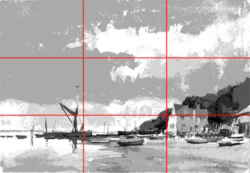
This coastal view is by Edward Seago. The horizon line is positioned about one-quarter of the way up the canvas – a division of land (or water) and sky which is quite common in marine and landscape subjects. Raising the horizon so that it aligns with the lower horizontal line of the grid would compromise the artist’s intention which is to emphasise the sense of scale and drama provided by the sky.
Are there any other alignments? The mast of the boat on the left lies close to the left vertical grid line and the gable end of the building on the right is adjacent to the lower right intersection. Both of these elements show strong value contrast with their surroundings and both act as focal points; the lit face of the building is probably the dominant focus.
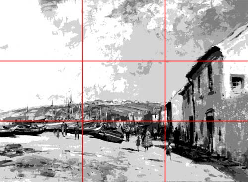
The next image is also by Seago. The subject matter is similar.
Here, there is a better correspondence between the lower horizontal grid line and the busy section of the painting with its boats, buildings and figures. The woman and child in the foreground are probably the primary focal point but they lie some distance from the nearest intersection point. A secondary focus might be the group of figures next to the lower left intersection.
It’s hard to see any significant agreement between the grid and the composition in this example.
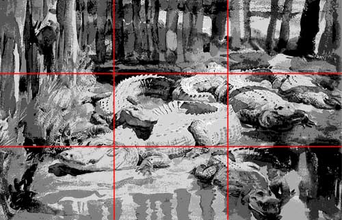
The next painting is by John Singer Sargent.
There is a rough division into thirds in this example with the subject split into trees, alligators and water (although one of the alligators has invaded the water section). The eye of the biggest alligator – surely the focal point – is aligned perfectly with the lower horizontal grid line and is close to the intersection; the head straddles the intersection.
Correlation here is pretty good.
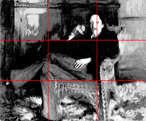
This is another Sargent example.
The head of the sitter (Robert Louis Stevenson) is aligned with the right vertical grid line but well above the intersection. Although the hands are subsidiary focal points (because of value contrast), they show no relationship to the grid.
The sitter’s lower right leg corresponds well with the left vertical grid line while the side of the chair is close to the right vertical.
Overall, there is very little correspondence.
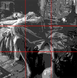
Here’s a third Sargent subject.
The table top and couch back align closely with the upper horizontal grid line; the head – the focal point – is just above it and to the right of the left intersection. The right side of the figure and couch correspond well with the left vertical.
There is some agreement between grid and composition, but not enough to preclude chance.
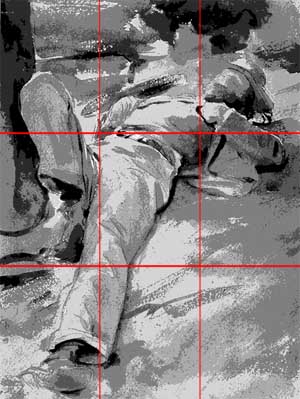
These two paintings, the first by Sargent again, the second by Quang Ho, are examples of pleasing arrangements which fail to show any unambiguous relationships to the Rule of Thirds grid.
I’ve looked at a number of other paintings by various artists and the results are nearly always the same: either negative or inconclusive. So does this invalidate the Rule of Thirds as a compositional tool? Not necessarily, it simply suggests that master painters compose their works in more varied and imaginative ways than Rule of Thirds allows.
However, even if composition-by-grid does work, it does raise some questions about its effectiveness.
First of all, does it represent a complete compositional system? The answer to this has to be ‘No’ – at least for the painter who, unlike the photographer, has to create his composition from scratch. For example, creating a focal point requires more than simply aligning an element of subject matter with a point of intersection. A focal area must contrast with its surroundings, it must dominate other competing sections of the painting; it may involve the organization of other elements to create directional cues – movement , linear perspective – to drive the eye to it. At best, Rule of Thirds is only a partial solution.
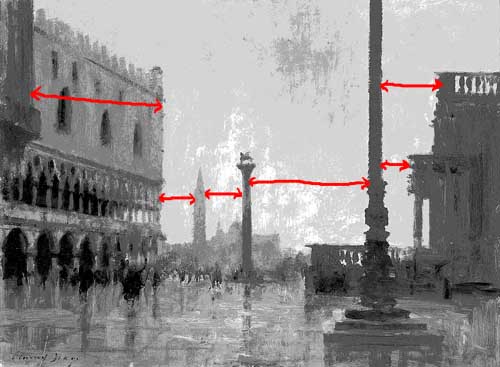
A more fundamental question is: ‘Does Rule of Thirds represent a compositional system at all?’ There is a danger in using a grid that it becomes a rigid compositional formula rather than an adaptable method or process. The result would be predictable, monotonous designs – much like the results of painting objects like trees and skies and water in a formulaic, mannered way. Because the Rule of Thirds grid is regular, it will tend to encourage regular alignments of subject matter – which is something that accomplished artists instinctively avoid. Look at this painting by Seago.
The intervals between the main vertical elements in the painting – from left to right, the Doge’s palace, the spire in the distance, the columns and the building on the right – are all different. Making the intervals different while preserving the balance of the composition adds visual interest to the painting. This is an important design principle and it applies not just to the spaces between elements, it also works with other properties such as value, colour and size. Seago has used this principle of variety to create a beautifully balanced work. I’ll return to the topic of design principles later.
notan
Notan is a term that crops up quite often these days in articles on composition. It is a Japanese concept that was popularized by Arthur Wesley Dow in his book ‘Composition – Understanding Line, Notan and Colour’ published in 1920.
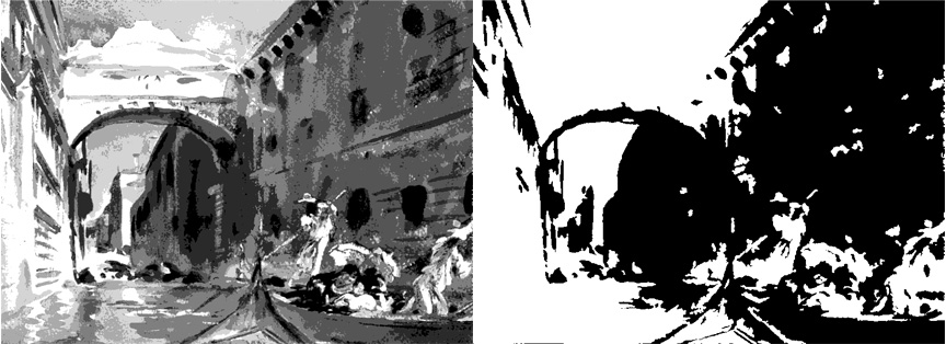
A notan drawing is a two-value or two-tone interpretation of a subject. Here’s an example:
On the left is a posterised version of the Sargent watercolour, ‘Bridge of Sighs’; on the right is a notan interpretation of the painting created in Photoshop using the Threshold option, which reduces a full-value image to a black-and-white one. A threshold value is selected and all values at or below that level are made black while all values above it are made white.
What information do you get from a notan study?
The main idea is to subordinate the subject matter to the abstract design of the work. The process merges individual forms into shape-value masses, sacrificing detail. The aim is to produce a value pattern between the black and white areas that is compositionally balanced. However, the problem then is, what do you do next?
Notan does not offer any help in re-establishing multi-value structure to the black and white areas which (unless you intend to produce a two-value finished painting) will have to be done. Notan doesn’t explicitly create a focal point; it tells you nothing about the elements of line or colour; and there are no gradations or textures. Notan studies are much easier to create if you have access to Photoshop.
I have a feeling that notan studies are more appropriate to the experienced painter rather than to the beginner.
However, there is an alternative to notan which is more informative and flexible, and better suited to painters of all levels. Unfortunately for technophobes, it involves Photoshop again.
Photoshop has two simple options which allow you to create posterised images. Posterisation reduces a full-value range (continuous tone) image to a specified number of values. Creating a three or four value interpretation instead of the two of notan, gives much more useful compositional information . The two options are Image>Adjustments>Posterize… and Filter>Artistic>Cutout…
elements and principles of design
The most comprehensive and rigorous approach to composition is embodied in the various interpretations of the elements and principles of design. It is a complicated topic and will be covered in a separate post.
